
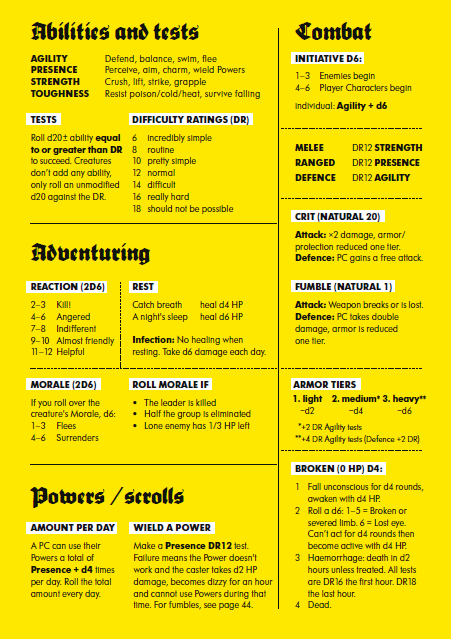
Mörk Borg is visceral.
Players should expect their senses and sensibilities to be violently assaulted. And they should expect to love every moment of it.
But there are already plenty of adequate reviews discussing these aspects of Mörk Borg the game. Instead, this one will analyze the design of this hybrid artbook/rulebook. In particular, it focuses on how Mörk Borg’s material features and design facilitate the game’s brutally sense-based and -driven experience.
Aural Materiality
Mörk Borg (often stylized in all caps, and don’t you dare forget the umlaut) is Swedish for dark fort, and it developed from a prototype solo dungeon crawler of that name. Designer and writer Pelle Nilsson’s choice to change the name—alongside expanding the gameplay and elaborating the themes and setting—could not have been more effective.
Dark Fort is an abstract image. It is too generic to compel strong interest.

MÖRK BORG is something you can (and should) roar while hacking some poor bastard in half with your zweihänder. (Again, don’t forget that umlaut.) You can feel the words in your throat and chest when you speak them; they are harsh and guttural, capturing the game’s tone from the moment you announce the title.
Physical Materiality
If you’re looking at Mörk Borg digitally, you’re missing out—in a big way. Yes, you’re getting all the mechanics and the exposition. And you’re getting most of the art and design, but not all of it. Some of the book’s most endearing features simply don’t survive translation between physical and digital media.
One of the best examples is the reflective foil used to print the graphic and title on page 16. The gradation of grays in the PDF indicates a reflective quality, but the authentic effect can’t be achieved digitally.

Subtler but more extreme is the book’s spine. Interspersed within the title are debossed characters that are effectively hidden from sight—until you turn off the lights and find PSALM VII (with the obligatory inverted cross) glowing in the freakin’ dark.
The PDF has no space for these and other purely material characteristics of the physical rulebook. There is no digital equivalent to a spine, and even if there was, it couldn’t replicate the texture and appearance of debossed, luminous characters.
Document Design
As I’ve argued elsewhere, rulebooks are technical documents. But Mörk Borg does not look like any technical document I’ve ever seen. And it doesn’t look quite like any other rulebook most gamers have ever seen, either.
But it is extremely useable—more so than most rulebooks. It strikes a remarkable balance between technical design needs and artistic design goals, and the book performs its technical tasks so well that you may not even notice what an excellent job it does.
(My only caveat is on page 19. Selecting an optional character class will alter your starting money and gear rolls, but the book explicitly directs the reader to generate these before making those fundamental character choices. For a first-timer, this causes friction. Once you’re familiar with the process, though, it’s pretty insignificant.)
All the game’s mechanics—including character creation—are so elegant that the book doesn’t need to belabor its technical aspects. It lacks a formal introduction and discrete segmentation, which are normally prerequisites for all instruction manuals. But Mörk Borg marches to the beat of its own blood-spattered drum, and readers can follow easily along.
The book surrenders the introduction’s space and energy to establishing aesthetics and atmosphere through depictions/exposition of the game’s setting and themes. Before a reader ever sees the core rules, Mörk Borg’s fictional reality seizes their imagination by the throat and abruptly hurls it forward into character creation with enough force to drive them to play this insane game.
And here’s where the technical design of Mörk Borg shines: every single in-game mechanic is printed across the front and back endpapers and the final page. The back flyleaf’s verso contains a comprehensive GM reference sheet that outlines almost every fundamental mechanic; only omens are missing, but only players use omens, and their effects are listed on the official character sheet. (Yet another outstanding design choice, by the way.)
Opposite the reference sheet is an index split into lore, mechanics, and stat blocks, enabling easy and fast navigation. The back flyleaf’s recto, the facing page’s verso, and the front endpapers are all given over to tools that facilitate misadventure and misery.
Mörk Borg, as a game and a book, is user friendly in the extreme. The elegant ruleset simplifies the work of the reference sheet and the index, but that doesn’t detract from how exceptionally well these apparatuses perform their work.
You can literally open the book and find exactly what you want. Play doesn’t grind to a halt. It’s a brilliant example of strong document design supporting the gaming experience.
Graphic Design
Artist and designer Johan Nohr leverages a fairly limited palette in the pages of Mörk Borg. The colors consist of black, white, achromatic grays, shocking pink and yellow, occasional muted blue, and brooding reds made more effective by their selective use. Nohr varies his style amongst illustrations, creating variety and visual interest, but ties this diversity together with the unity of his carefully chosen colors.
More subtly, but no less effectively, Nohr strategically draws on public domain art to supplement his own. Credited to “dead people” on the book’s front cover, these artworks contribute powerfully to the reading and play experiences.
Take, for example, the woodcut prints found throughout. Given the setting’s roughly medieval level of technology, these are the sorts of images the characters will encounter in the world. The designs meld nicely into the book’s extensive use of monochromatic contrast, and they add a crucial sense of time and place that players will bring to the game.
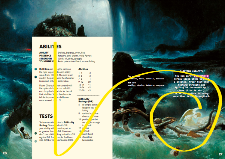
Another example with a very different function is the full-page spread of Francis Danby’s The Deluge (1840). This oil painting—the only full-color image in the book—subliminally intensifies tension at the crux of character creation. As the reader’s eyes move from left to right, their path is swept up in the floodwaters’ trajectory and sucked down toward an implied abyss whose only exit is a gruesome end.
Welcome to Mörk Borg.
Typographic Design
Nohr unapologetically exploits the concrete, visual dimension of the text to its fullest extent. The copyright page reports “over a hundred” typefaces are used in the rulebook. It doesn’t enumerate them, and I haven’t counted, but I don’t doubt that claim.
Although readers tend to look “through” writing to the information conveyed, no one can ignore the heterogenous sprawl of material language packed into this rulebook. The text’s variety adds immeasurably to the overall visual appeal and dominant aesthetic.
Nohr’s most iconic choice, in my opinion, is the inclusion of Blackletter (“Old English”) script. Scripts are typefaces that mimic handwriting—in this case, handwriting found in medieval manuscripts. But in Mörk Borg’s overall visual context, Blackletter functions less as a script and more as a grunge typeface—one that is intentionally visually expressive. Blackletter, like the woodcut prints, conveys a grim, medieval temporality and atmosphere, further contributing to the intended game experience.
Altogether, Nohr’s various typographic and textual design choices strongly recall the textual and typographic experimentations of early 20th century poets like Filippo Tommaso Marinetti, Ilia Zdanevich (Iliazd), and Tristan Tzara. The influence of Tzara, who adopted conventions of print advertising, is most evident in Nohr’s adaptation of the overall zine aesthetic; the images below juxtapose Nohr with Marinetti and Zdanevich to expose specific visual echoes.
Exploring these similarities would be a blog unto itself, so I’ll offer only this observation: by deploying these typographic tactics, Nohr reiterates material innovations in modern design and poetry that signaled a radical artistic break from tradition and formal expectations—a break reenacted in Mörk Borg’s purposeful divergence from the dominant trends of tabletop roleplaying games and the industry’s standards and practices pertaining to rulebooks.

F.T. Marinetti, “In the Evening, Lying on Her Bed, She Reread the Letter from Her Artilleryman at the Front,” 1919, public domain; Johann Nohr, troll. The latter is ©2020 Ockult Örtmästare Games and Stockholm Kartell.

Ilia Zdanevich, from Lidantiu Faram, 1923, public domain; Johann Nohr, Bad Habits layout. The latter is ©2020 Ockult Örtmästare Games and Stockholm Kartell.
Conclusion
Mörk Borg must be seen and played to be fully understood. It won’t appeal to everyone, but to any person possessing the right sensibility—eclectic gamer, metalhead, art junkie, apocalyptic-fantasy-horror buff—it delivers a unique and exceptional experience. And that experience’s driving force is the physical book.
Mörk Borg is an object to be examined and appreciated. It is not simply game mechanics to learn, a text to read, or an artbook to peruse; the union of all three dimensions lifts both book and game exponentially higher than the simple sum of those parts.
I didn’t have enough space here to talk about all the amazing features in Mörk Borg. Tell me about your favorites in a comment!
Liber Ludorum is entirely reader-funded. Please consider lending your support.
Related posts

Basilisk’s Legacy: from Dark Fort to Mörk Borg
The prehistory of a spiked flail to the face

Ex Libris Mörk Borg
Reflections on an annotated bibliography of official, semi-official & community content for Mörk Borg

A Festive Apocalypse
Mörk Borg & Medieval Carnival culture
Recent posts


Reminiscences of the Future, Part 3: Gaming Against Disaster & Dystopia
Richard Duke’s philosophy of gaming against disaster & dystopia
Reminiscences of the Future, Part 2: A Theory of Gaming
Richard Duke’s philosophy of gaming against disaster & dystopia

Similar to the other physicality highlights you mentioned there are those super cool and thematic instructions to deface and destroy the book. Like throwing a dagger at the traits page and burning the book at Psalm 7:7. It makes it like you’re holding a book of ancient more evil. I wonder if anyone has actually burned the book haha!
Also your writing is really good! You pointed out a lot of interesting references like the poetry and Deluge art piece I didn’t notice. I just read a couple of your Mürk Borg articles and they’ve all been really good. I can’t believe there aren’t more comments, I feel like I stumbled upon a little treasure hoard of a website!
LikeLike
Thank you! I’m glad you’ve enjoyed the articles (and MB). Johan and Pelle burned a copy at the release party back in 2020, and they shared this video of a fan burning their copy: https://twitter.com/morkborg/status/1297413536520577027?lang=en So that’s at least two down…
LikeLike